
© 2026 RZR GLOBAL INC
The Brand
This brand guide defines how RZR shows up in the world. It ensures that every expression of our brand—from product marketing to events, social media to design—communicates the same clarity, precision, and impact.RZR operates in a competitive and often indistinguishable category. Consistency is how we stand apart. This guide provides the strategic foundation and visual principles that help teams, partners, and collaborators bring the RZR brand to life with confidence.It is not a rulebook for design alone—it is a framework for how we communicate our mission to make brands impactful at scale.

Our Strategy
Ad Tech operate in a sea of sameness—corporate blues, technical jargon, and forgettable logos that could belong to any player in the market.But RZR is not built to blend in.While others compete on scale and automation alone, RZR exists to create impact. Our platform transforms signals into strategy and impressions into meaningful growth for the world’s most ambitious brands.Our strategy is simple: stand apart.The RZR brand is designed to reflect intelligence in motion—sharp, precise, and fast. It breaks the pattern of generic adtech design by embracing edge, precision, speed, and humanity.Because in a category defined by sameness, the brands that win are the ones bold enough to be unmistakable.
Brand Story
Growth is an intelligence game. It’s about predicting which users will drive revenue at the moment of impression, not after conversion. It’s about optimizing across channels as one learning system that gets sharper with every signal. It’s about predicting outcomes, not reacting to them.RZR is built for this reality.
Our proprietary neural architecture identifies high-value users before competitors see them, calculates conversion probability and revenue potential in a single bidding decision, and optimizes UA, retargeting, CTV, and influencer as one connected brain. We don't chase volume. We observe patterns, learn from signals, and predict value. When the data confirms opportunity, we strike with lethal precision. This is retention-led growth powered by intelligence that predicts value at the impression level. This is where intelligence makes impact.
This is RZR.
Our Positioning
Where intelligence makes impact.
Brand positioning defines the unique space a brand owns in the market. It clarifies how we are different from competitors and why that difference matters to customers. By establishing a clear point of view, brand positioning guides messaging, design, and storytelling so every expression of the brand consistently communicates what we stand for and the value we deliver.
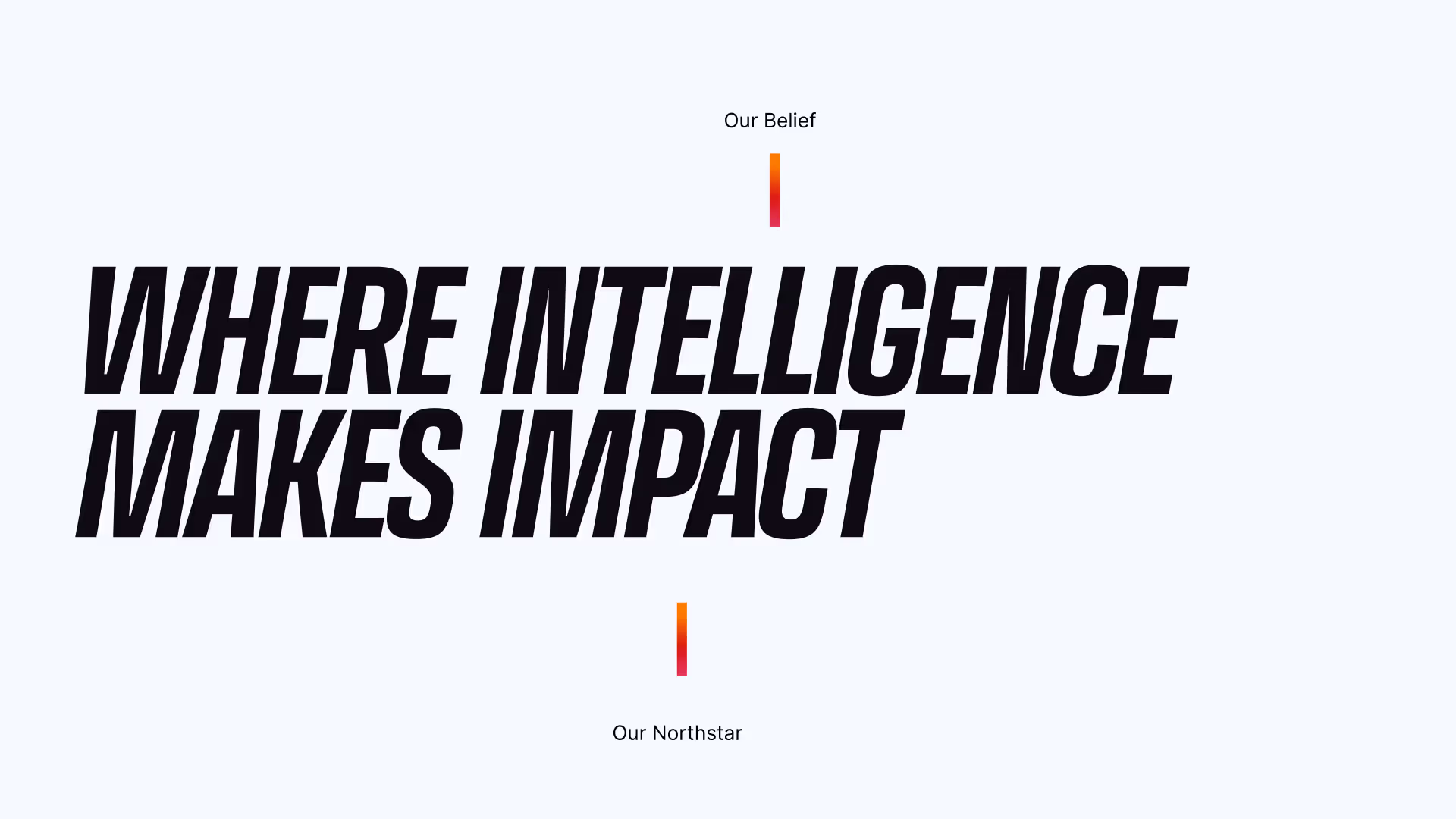
Brand Framework
Our mission
To make brands impactful at scale
What we believe
Intelligence is measured by the impact it creates
How we do it
Intelligence-powered impact that gets sharper with every signal
Logo
In this section you'll discover the backstory of our logo's creation, the symbolism embedded in its design, and the guidelines ensuring its consistent and effective usage across platforms.
The logo
Sharp angles. Forward motion. This logo does not blend in.Every element has a purpose:
-Sharp geometry = Edge and Precision
-Forward-leaning angle = Speed
RZR’s product-first mindset and technological superiority becomes our partners’ competitive edge.We measure and optimize with precision to cut to the root of what’s driving results.RZR moves with explosive speed but never sacrifices control.
About Trademark
Purpose: It signals that RZR is claiming trademark rights to the mark.Use the ™ version when the logo appears in more formal, external, or first-mention contexts.
Typical uses
1. Website footer or first brand appearance
2. Marketing materials
3. Ads and campaigns
4. Sales decks
5. Press releases
6. Legal or investor materials
Logo color usage
The RZR logo should always maintain strong contrast to ensure visibility and brand impact. When placed on the Combustion Spectrum background, the logo should appear in white for maximum clarity. The Combustion Spectrum symbol should sit on black or white backgrounds to preserve color integrity and legibility. When placing the logo on photography, ensure the symbol remains clearly visible and does not blend into the image.
Primary Logo
The primary logo used on light backgrounds.
Typography
Typography is one of the cornerstones of our visual identity. A good pairing of fonts and a strong hierarchy ensure maximal visual impact. Beneath you will find information about the typefaces we use.
Primary Typeface
Bold and unapologetic. Chosen to cut through the noise.Two typefaces. Two purposes:
Transducer
Headlines that command attention
Transducer's industrial strength and geometric precision mirror our product. Wide letterforms own space. Sharp terminals refuse to blend in.
Inter
Body copy that drives clarity. Inter's clean readability ensures our insights land with impact.
Colors
At its core is the Combustion Spectrum, a high-intensity gradient moving from Ignition Orange through Critical Red to Radiant Magenta. This gradient represents the full burn cycle of growth: activation, peak output, and amplified impact. It’s bold, urgent, and impossible to ignore.Balancing that heat is Acquisition Blue is a precise, electric counterforce. It represents intelligence, optimization, and control.
Primary Brand Colors
At its core is the Combustion Spectrum, a high-intensity gradient moving from Ignition Orange through Critical Red to Radiant Magenta. This gradient represents the full burn cycle of growth: activation, peak output, and amplified impact. It’s bold, urgent, and impossible to ignore.Balancing that heat is Acquisition Blue is a precise, electric counterforce. It represents intelligence, optimization, and control.
Product Colors
The product colors are designed to clearly differentiate each offering while maintaining alignment with the Combustion Spectrum ecosystem. Unlike the core combustion gradient, which represents overall brand energy, the product colors represent functional specialization.Each color reflects the role the product plays within the growth cycle — distinct in tone, but unified in intensity.
Tone of Voice
Bold
We communicate with confidence earned through technological superiority. We make strong claims and back them with data. We are direct about what sets us apart because our product earns that right.
- Lead with differentiation, not generic benefits
- Use active, declarative statements
- Avoid hedging language (might, could, potentially)
- Use data to support bold claims with specific proof points
Precise
We communicate with clarity and cut through industry jargon with insights that drive impactful decisions. We are data-savvy but not obscure; technically accurate but not overly complex.
- Use specific numbers and data over vague claims
- Replace jargon with clear and specific information
Urgent
We convey speed and momentum without creating anxiety. Our tone is dynamic and forward-moving. We emphasize time-to-impact. We are first movers who act decisively when data confirms opportunity.
- Convey controlled urgency, but not panic
- Use short sentences to create rhythm and pace
- Emphasize rapid iteration and real-time results
Human
We balance technical sophistication with warmth and partnership. We tell stories with real outcomes. We remind our audience that behind our tech is a team of experts who bring intuition, creativity, and strategic thinking to our offerings.
- Tell client stories with real challenges and triumphs
- Show actual team members, client interactions, and results
- We celebrate our partnerships and the people behind campaigns driving real results
Brand Expressions
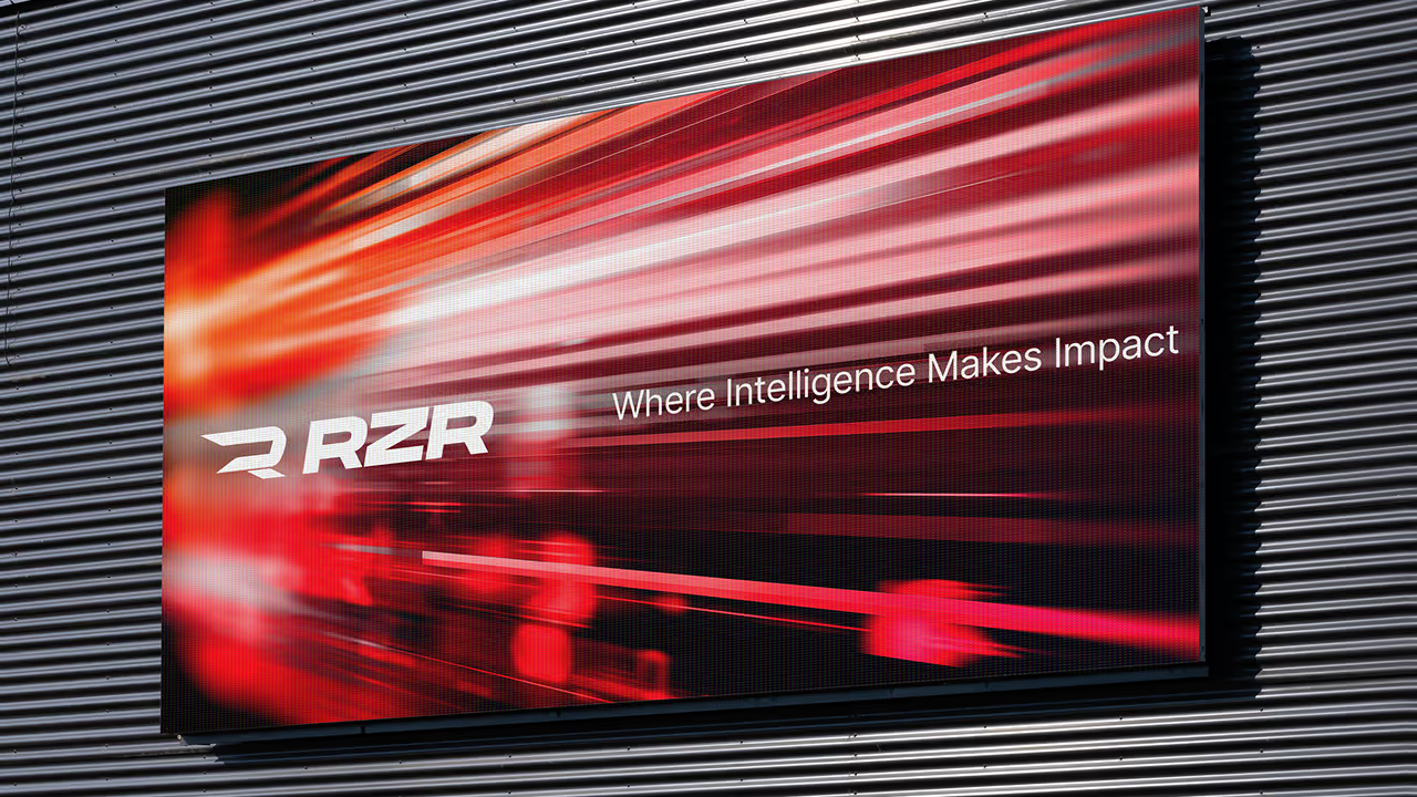
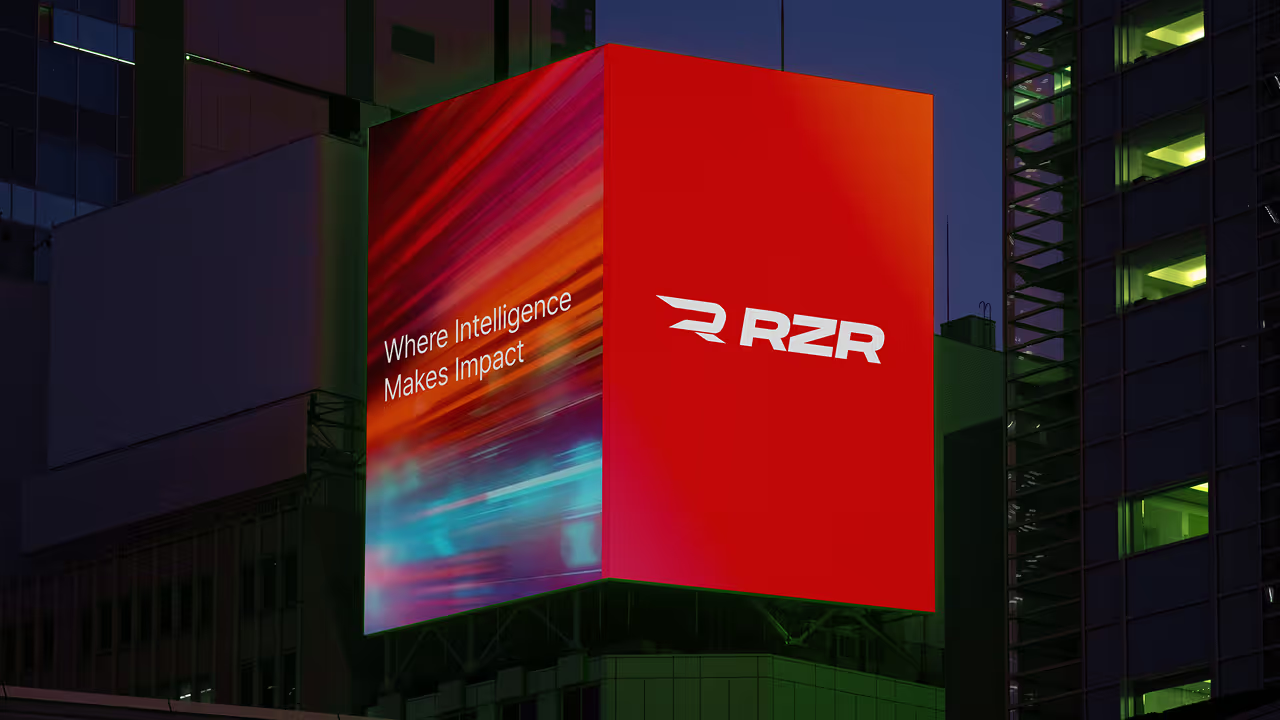
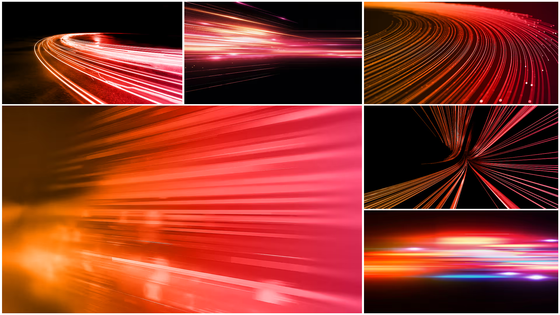
Supporting graphic elements and patterns can be used to add details and attract attention. Our pattern comes in different colorways.
Performance Mode
Communicate technology, optimization, and measurable performance
- Data signals and nodes
- Gradient streaks
- Product color highlights
- Structured layouts
Editorial Mode
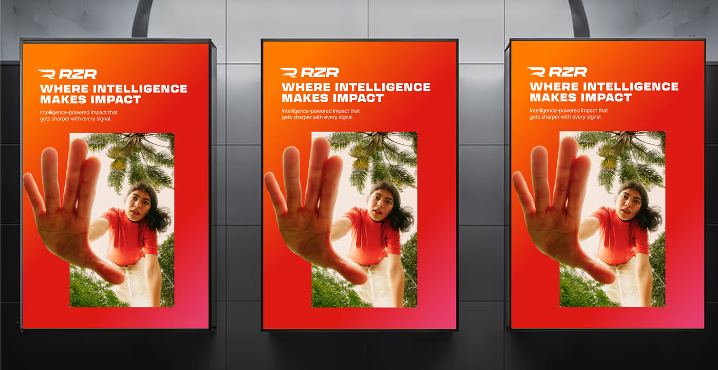
Position RZR as an industry voice and cultural participant, not just a platform.
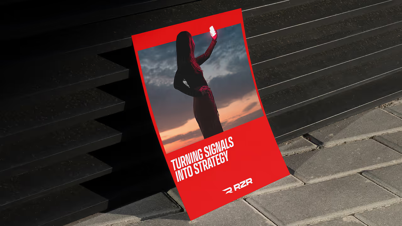
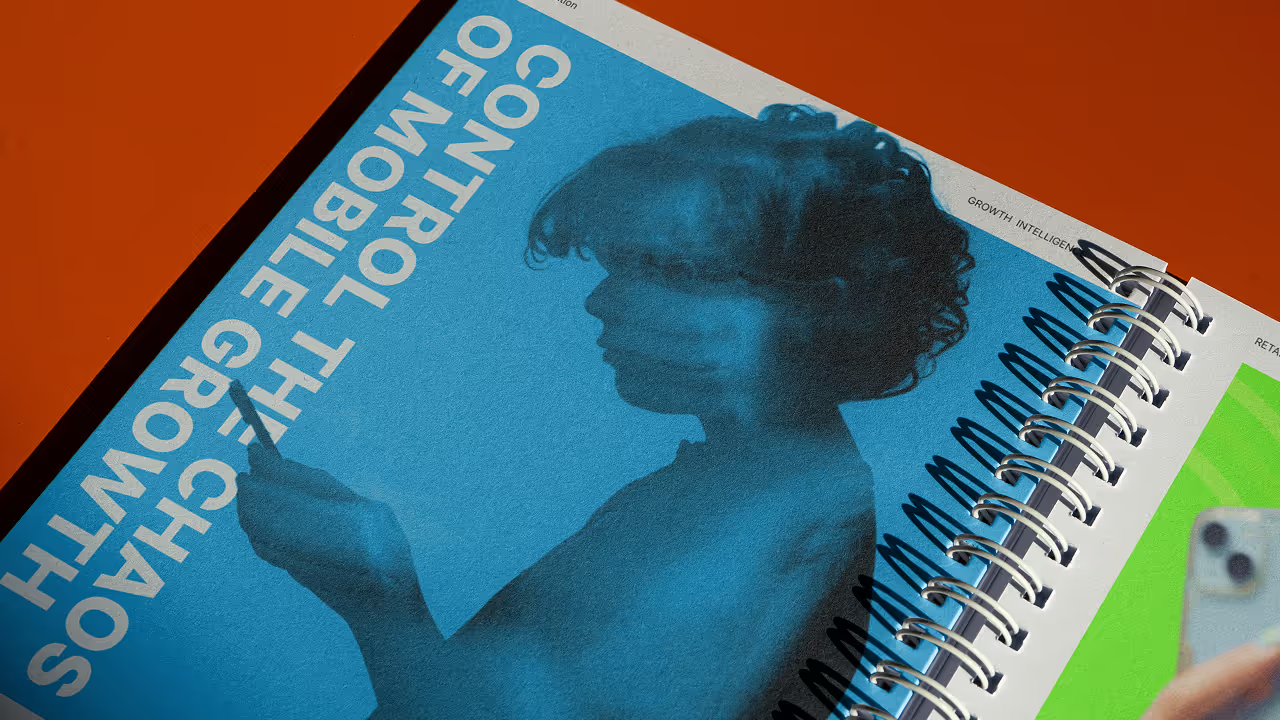
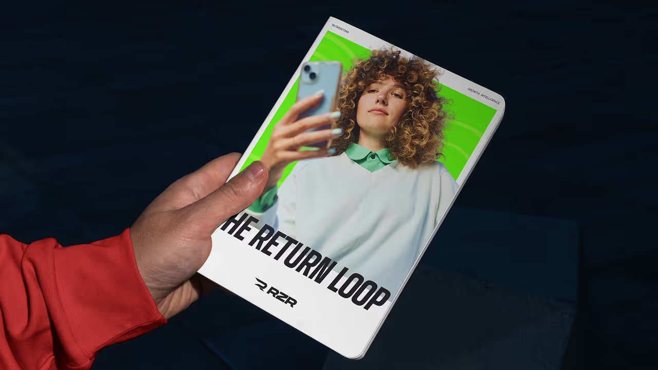
- Cinematic photography
- Large typography
- Strong negative space
- Subtle color accents
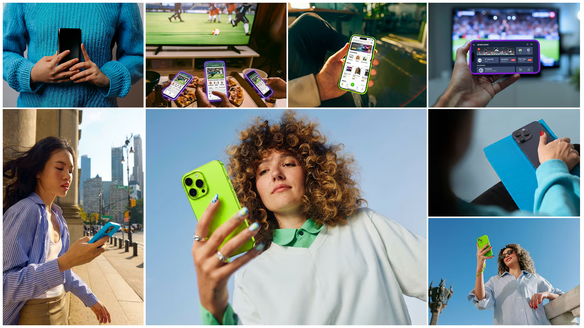
Photography
Our website is the main touchpoints for our global clients. The look and feel of our website is in line with the overall identity and offers a great set of services, resources and subpages. Our CMS allows internal editors to easily create new and engaging content.
Applications
Logo application defines how the RZR logo should appear across different environments and formats. It provides guidance on appropriate backgrounds, color variations, and usage contexts to ensure the mark remains clear, consistent, and recognizable. Following these principles preserves the strength of the brand and ensures the logo always represents RZR with clarity and impact.